 |
| I AM QUARTERED! |
Click the 'read more' link below to view the article.
So you've decided you want to create a Home Brew Chapter, or you're at least thinking about it - or maybe if you're really that new, you're wondering just what I am talking about - to start things off, a Home Brew Chapter is a force that you design from scratch - it is quite common amongst our more creative hobbyists and there is nothing wrong with creating a Home Brew chapter; and we're here to help you do that.
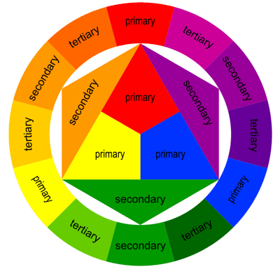
One of the first, and seemingly most important steps is to design a colour scheme - this can be a lot harder then you think; especially if you're trying to do something entirely original and not channel a pre - existing chapter. There is always that pit - fall if you do a blue and gold scheme that people will think you're doing an Ultramarines chapter; which may be rather disappointing after you've poured your heart and soul into creating your unique force of super men. There is a reason why most of the good colour scheme's you can think of have already been created in some way or another - your exact placement of colour may vary though - is that the folks at GW understand colour theory and know how to make some very cool and appealing colour schemes for their miniatures. If you're having trouble really creating a cool colour scheme, there are a few things you should understand before you put brush to model (and waste money on 'test' models like I have in the past) and one of the most important is colour theory. It is a theory taught in all art schools because it discusses the way colours mix and how they contrast, two very important things to know when choosing your colours. If you really want your models to 'pop' on the battlefield, choosing colours that contrast each - other in an extreme way will certainly draw attention; not always in a good way however. Colour's that are opposite to each other contrast heavily, whilst the closer they are the better they will blend together. This is a confusing concept to explain with text as it can't do the nature of colour any justice. You can't really define blue with words for example.To help with this we have the colour wheel:
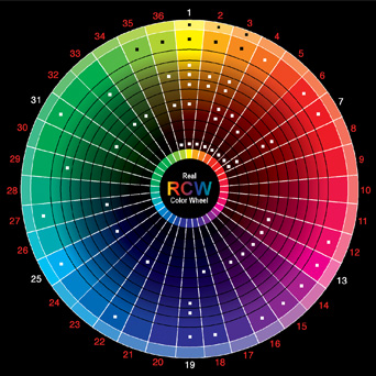
You will notice that there are three primary colours at the core of the colour wheel; these are the three boldest colours and form the basis from which all other colours are derived - understanding the implications of this chart will help you with determining what colours contrast the most, and also help you to learn how to mix paints properly. For example, If I mix red with blue I get violet, If I add more blue I get purple, with more red I will get pink, and if I add yellow I will end up with brown (colours opposite sides of the wheel will not mix properly). You will also notice neither black or white are part of the circle, this is because they are tones of colours and not colours themselves. You can also use this wheel to show that the greatest (and most eye - catching) combinations of colours are at opposite ends of the spectrum - purple and gold clash, red and green clash (we're all aware of that one) - however in some case's these might not be the most aesthetically pleasing. The opposite is also true, the closer a colour is to another on the wheel the less they will stand out - if I have 50 shades of purple it won't really stand out properly nor will it really be visually appealing (unless you really love purple). Needless to say, colour theory is too complex for me to really teach you about in a profound manner, but you do need to have a basic understanding of its principles in order to increase your painting skills and better inform your colour choice. One helpful thing you can do is vary the shade until you get the desired look - red and green may not look quite so bad with a very pale pink and a very dark green for example. For your reference here is a really good colour wheel I found:
So now that you're a master of colour theory, you should get to painting some models are try out some awesome colour schemes, right? Wrong - well, unless you're positively overflowing with both time and disposable income there are better alternatives - such as the space marine painter available online right here - this nifty little tool will help you to plan out your miniatures in advance, and the clever program will even try to match paints to the colours you choose - it really is a life saver, and an excellent tool for every Marine player thinking of starting up a new army.
Some suggestions for when you are picking colours is to start with a base colour and work from there - this should be a strong, bold colour to really represent the glorious and brave (silly) Space Marines wanting their foes to know just who is about to fill their face with rocket propelled grenades; the most iconic Chapters such as the Ultramarines, the Imperial Fists and the Dark Angels all have bold primary colours as the basis for their look - which is then accented with some complimentary (closer on the wheel) secondary colours and heavily contrasting 'spot' colours used in small amounts to highlight details such as eye lenses and plasma effects - this will help to offset the model and help them to stick out just that little bit more.
The next thing, which will be part of your planning stage - is to choose a company that your marines are a part of (this is only necessary if your force is codex compliant; Chaos Space Marines will not traditionally have company colours) - and also decide on your veteran colours and what not; you can find out more about space marine heraldry and designation schemes here which will help you make your fledgling force feel more real fluff - wise.
 |
| An example colour scheme |
You can also begin work on a symbol for your chapter, however this need not be complicated - as you can utilize another chapter's heraldry with some modification - or you can create your own. If you're all finger's and thumbs when it comes to free - hand or fine detail work, consider using simple geometric shapes and practising on a piece of paper first before you try and paint it on to a model; some people choose to skip this step and only use chapter symbols on their vehicles if at all; a good work around is to have the squad designation on the left shoulder pad and the unit type (devestator, tactical etc) on the right pad.
The best way to really get a feel for how a chapter should look is by consulting existing chapters and their use of colour to represent their personality and members - some interesting tid - bits can be appropriated or can provide inspiration for your force; I found the use of markings in the World Eaters legion to designate those who had undergone the psycho - surgery to turn them into frothing lunatics to be a really interesting type of marking, or how the Dark Angels utilize different colour schemes within the same force to denote members of the elite Deathwing and Ravenwing formations.
I hope the article has been helpful for you guys, or it helped to inspire you to really get working on your home brew chapter and put brush to model with confidence. Next time we will be discussing how you can go about designing the core of your army, designing a theme and really developing the back story to compliment your personal legion. As always we invite you guys to leave your critiques and suggestions in the comment section below, or to find us over at the +Bell of Lost Souls lounge.


On the off chance that you need to include a totally different component of enjoyable to the game, you can utilize Sims 4 undermines the PlayStation 4 to change everything from how a lot of cash your sims have in the bank to who they begin to look all starry eyed at.
ReplyDeleteDownload latest sims 4 need cheats fill
Imperator Guides: Creating A Home Brew Chapter - Colour Schemes >>>>> Download Now
ReplyDelete>>>>> Download Full
Imperator Guides: Creating A Home Brew Chapter - Colour Schemes >>>>> Download LINK
>>>>> Download Now
Imperator Guides: Creating A Home Brew Chapter - Colour Schemes >>>>> Download Full
>>>>> Download LINK d3